When it comes to e-Commerce websites, product pages usually steal the spotlight. But here’s a reality check: most shoppers don’t start there. They start with product cards, the bite-sized previews that make or break a browsing experience. Optimising these will help push your store to the next level.
The Problem: Decision Fatigue for Busy Shoppers
We recently worked with Totem Bags to design and develop their Shopify store. Their target audience? Busy moms who don’t have time to dig through pages of information just to figure out if a bag fits their child’s needs.
If your customers have to click into every single product just to answer basic questions, you’re creating unnecessary friction. And friction kills conversions.
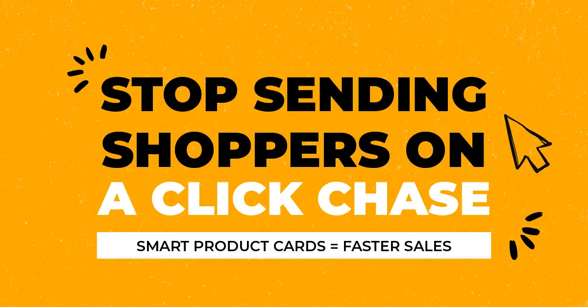
The Solution: Smarter Product Cards with Metafields
We distilled the most common customer questions into key decision-making points, product features like age range, material, literage, ergonomics, piece count, and other USP’s. Instead of burying this info deep in the product page, we brought it forward using Shopify metafields and displayed it directly on the product cards.
Now, shoppers can compare product details at a glance, get their questions answered immediately, and buy without unnecessary clicks.
Simple, but game-changing.
Why This Works (And Why You Should Do It Too)
- It Reduces Friction: No one wants to play detective just to buy a bag.🕵️
- It Speeds Up the Decision-Making Process: Quick answers = faster purchases.💸
- It Enhances Mobile Shopping: Scrolling and clicking through multiple pages is a pain on mobile. Product cards with more info = less frustration.📱
- It Builds Trust: When customers can see all the details up front, they feel more confident hitting that “Add to Cart” button.🤝
How to Implement This on Your Store
- 🔑Identify Key Customer Questions: What do shoppers NEED to know before they buy? (Hint: Check FAQs and support inquiries.)
- 🔎Use Shopify Metafields: Add custom data fields that showcase critical info right on the product card.
- ✏️ Design for Clarity: Keep it clean and scannable. Icons, bullet points, and concise text work wonders.
- ♻️ Test and Iterate: Monitor engagement and tweak as needed. (Pro tip: A/B testing different information placements can reveal what works best.)
The Takeaway: Product Cards Are More Than Just Pretty Pictures
Most e-Commerce stores treat product cards like digital business cards, name, price, and an image. But when done right, they become powerful conversion tools. Totem Bags is already seeing the impact, and so can you.
So, what’s your take? Are your product cards pulling their weight, or are they just sitting there looking pretty?